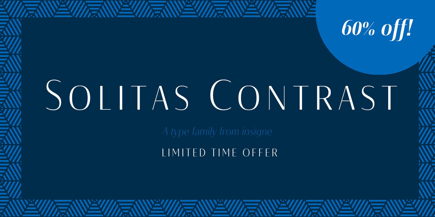

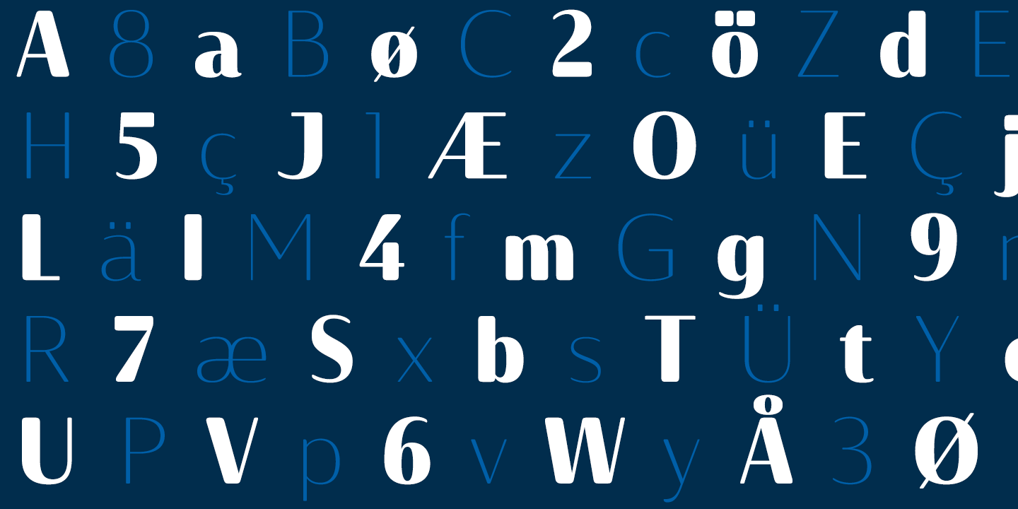
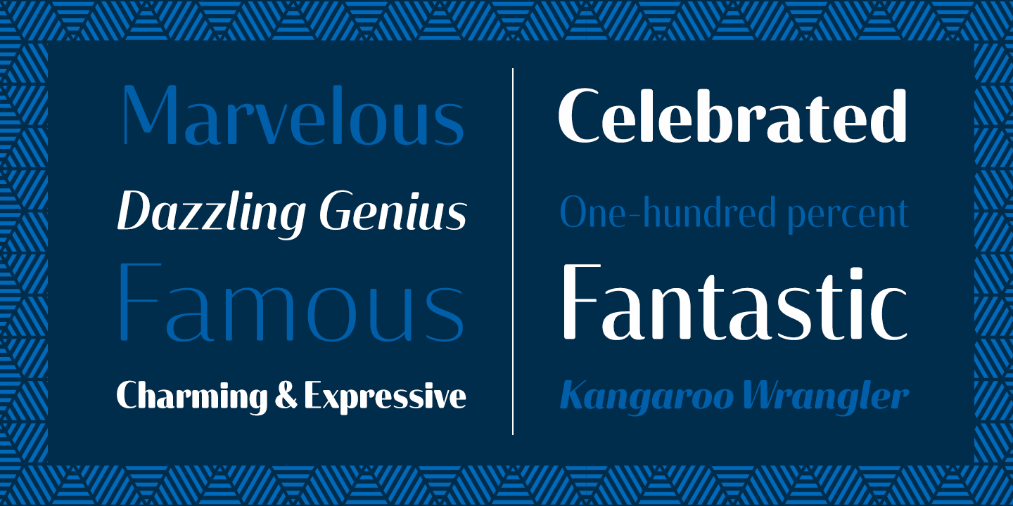
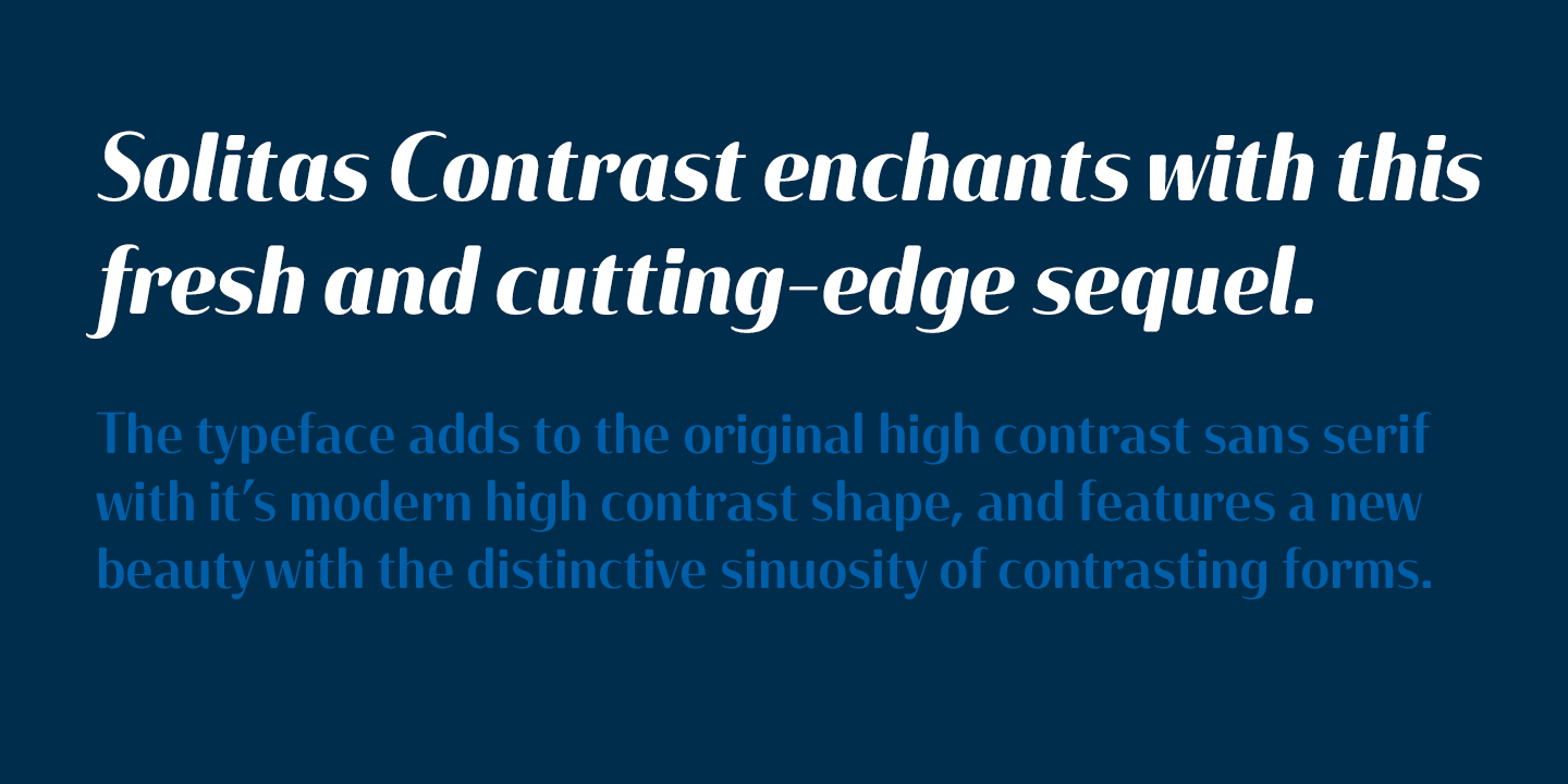
This sleek, high contrast typeface means business, but it looks great on any project, no matter how big or small.
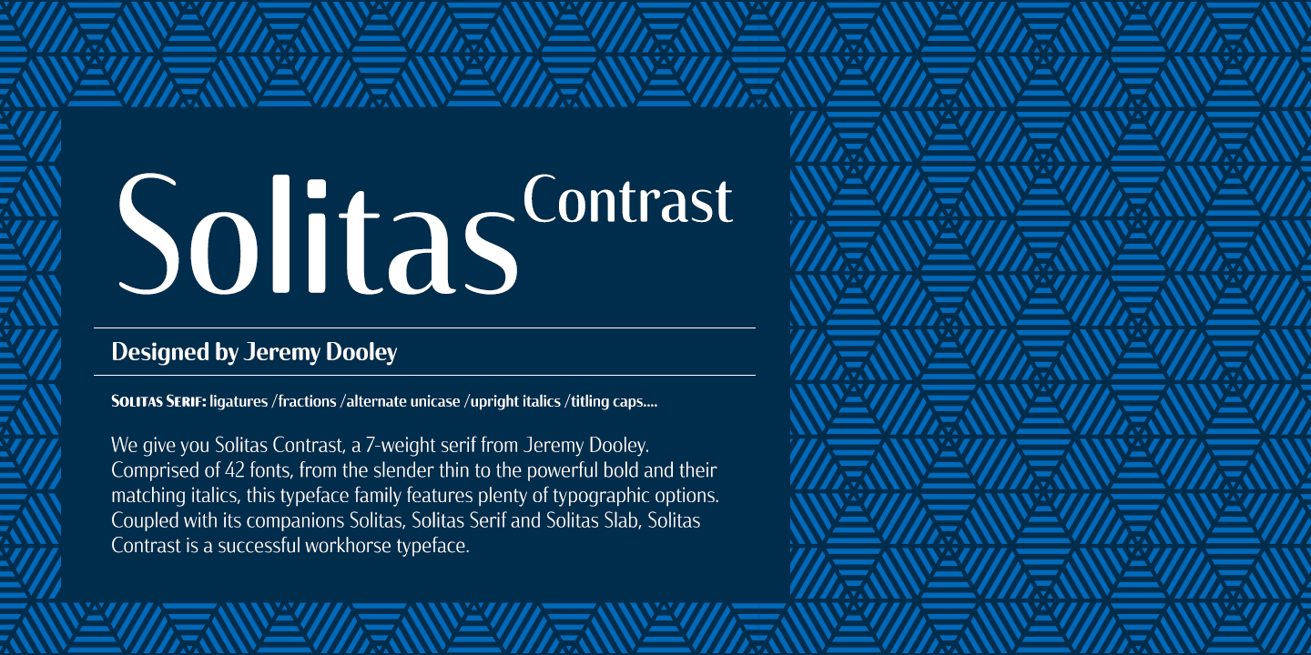
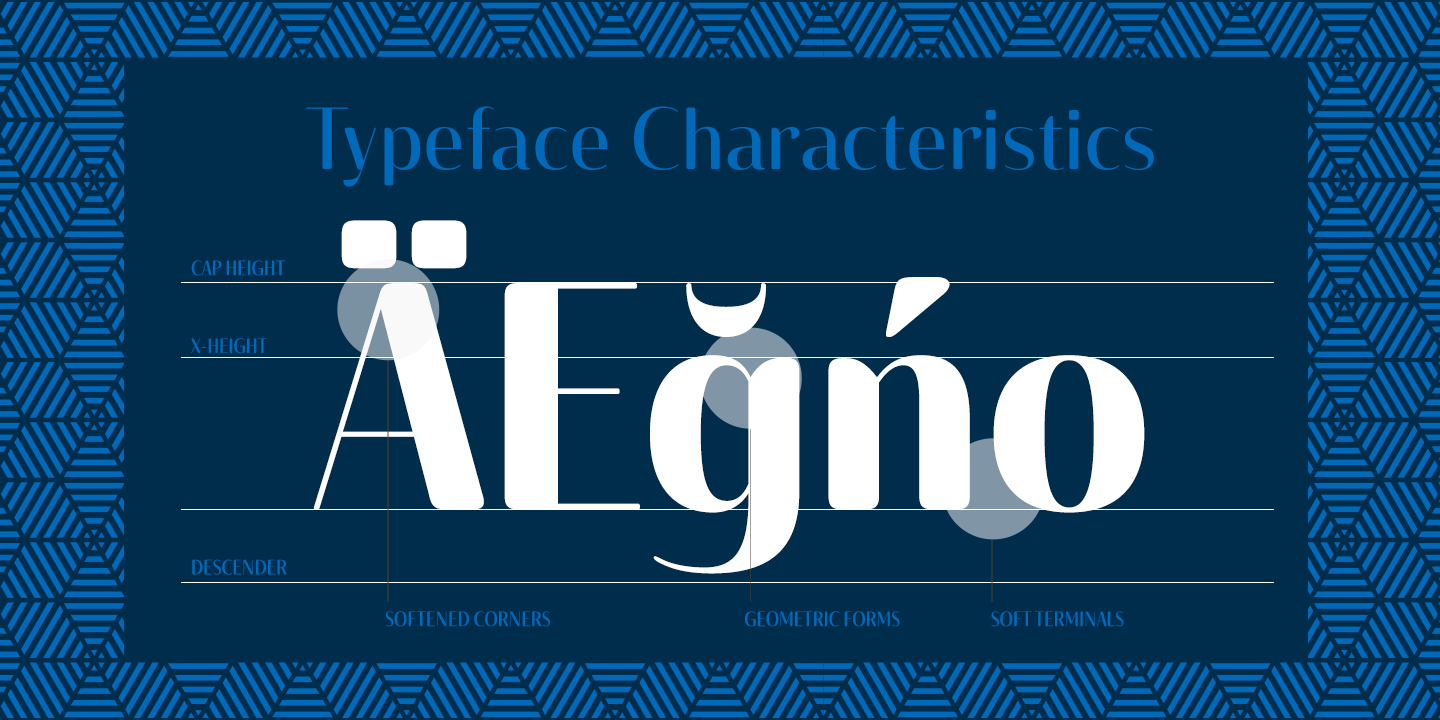
Solitas Contrast was developed because existing high contrast sans options were neither modern nor crisp. This design challenge was solved through a series of typefaces: the original low-contrast Solitas, its serifed cousins, and now a high contrast sans—each carefully considered for an organic and free flowing look. It evokes a Dutch or european feel.
Solitas Contrast is a modern, clean sans-serif with a distinctive style and impact.